case: Think Earth Environmental Education Foundation

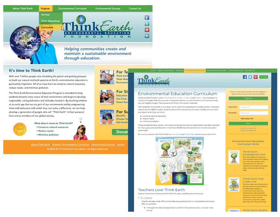
In 2005 Think Earth approached us to redo their ailing website and give them a polished look. Their logo had an old feel and the website definitely needed work. They were in an expansion phase. Traditionally they were very well known for environmental education curriculum for school-aged children.
So, we had a couple of consultations in person and over the phone. They wanted to keep an element of playfulness from their old logo globe but needed a more polished look and feel. So, we took that and refreshed it with a much more professional look.
Following the logo refresh, we worked on a new look and structure for their website that organized their content in a visually appealing way. We also moved them over to our modern web hosting service for more power and flexibility going forward.
They mentioned that they wanted to take their curriculum online. So, that’s what we did! Starting with their home and school surveys we created a web application for a school system in the Los Angeles area. Kids would take the surveys both in school and at home and it provided feedback on how they could better “think earth” based on their survey answers. It was used by hundreds of school-aged students and even provided some great data for analysts!
We then did a refresh again of their website about 10 years later to its current look and feel and doing a lot of other projects large and small along the way.
We’ve had the pleasure of helping them on many projects for over a decade. They are great, passionate people and a pleasure to work with.
